Delta's new uniforms...Huh?
I live in Atlanta so I understandably write about Delta Air Lines quite a bit. It's my favorite domestic airline and the one I fly most frequently. I pick up on stories that might not otherwise draw too much attention. However, this week's introduction of new uniforms was the type of event that drew coverage from well beyond the blogger community and even the Atlanta mainstream and business press.
On Tuesday at its Atlanta headquarters, the airline unveiled new uniforms for "approximately 60,000 Delta employees working as ticket and gate agents, at the Sky Club and in flight" as well as ramp personnel and Tech Ops. According to the Atlanta Business Chronicle, "Delta’s last uniform update was in 2006 for above-wing employees and 2000 for below-wing employees." A group of 1,000 employees will test the new designs on-the-job from December through March 2017. Full rollout is slated for early 2018.
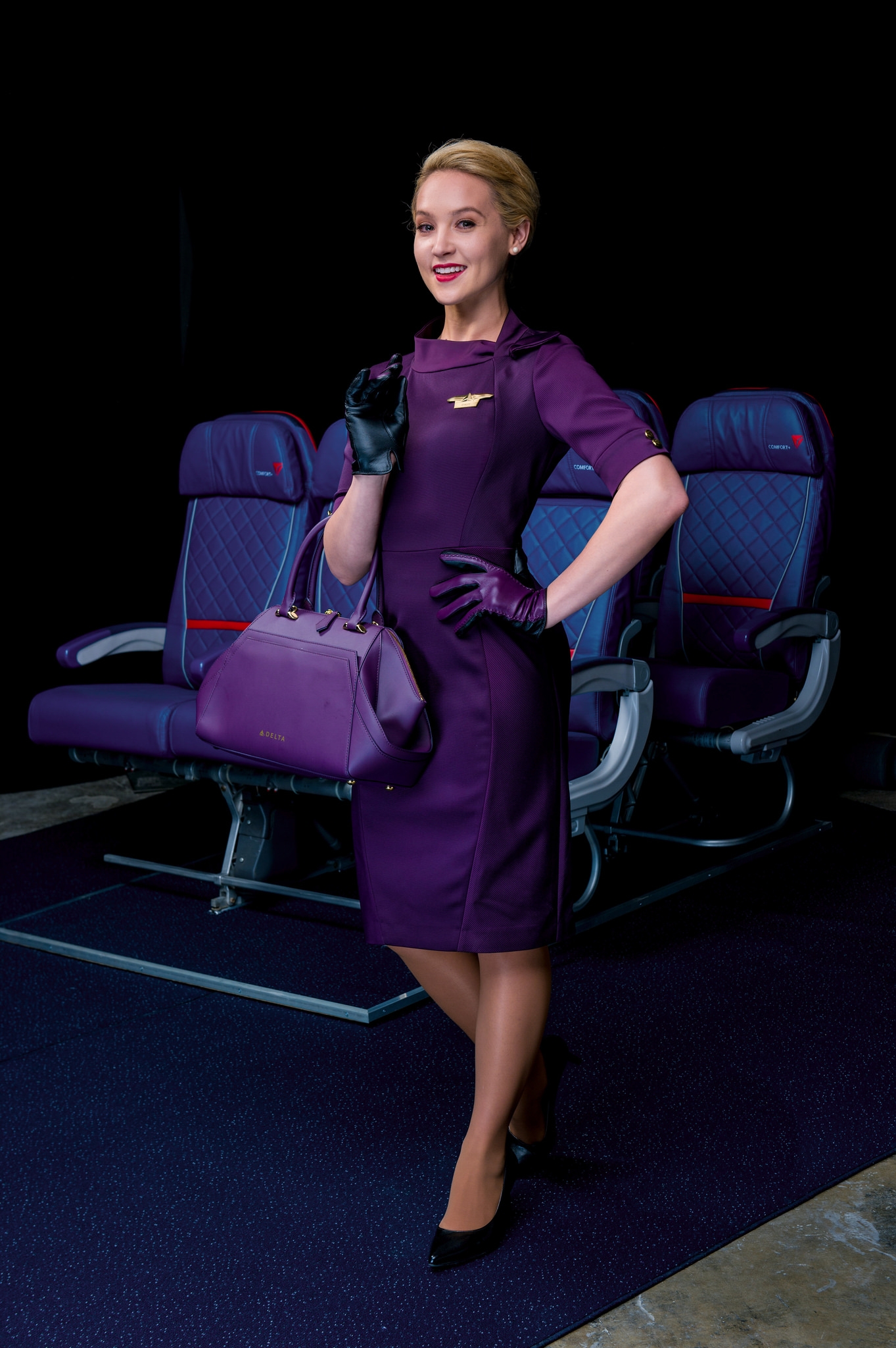
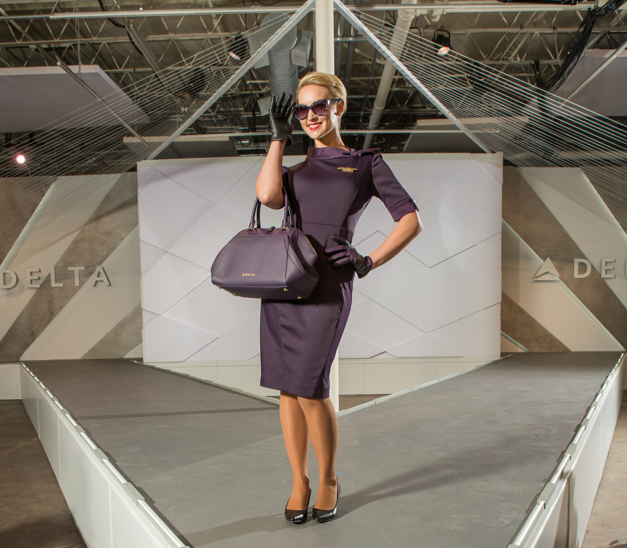
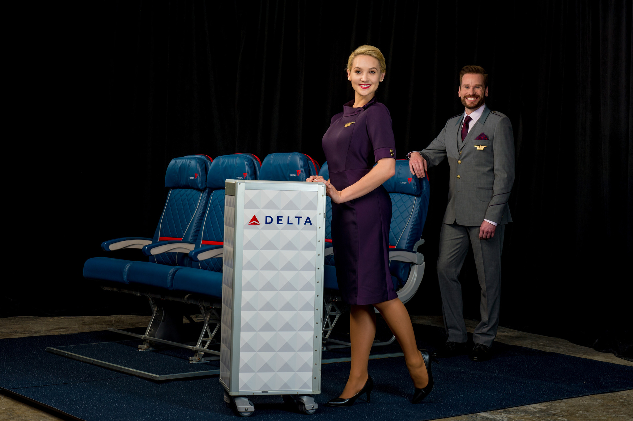
One of the new Delta flight attendant designs looks quite retro (click to enlarge) (Photo: Delta Air Lines)
An attractive design...
Let me preface my comments by saying I am not a fashionista. About the only fashion designers I know are Ralph Lauren, Tommy Hilfiger and some brothers named Brooks. I had never heard of Zac Posen before the Delta uniform announcement. I glean what colors work together because a sports team may use certain color combinations.
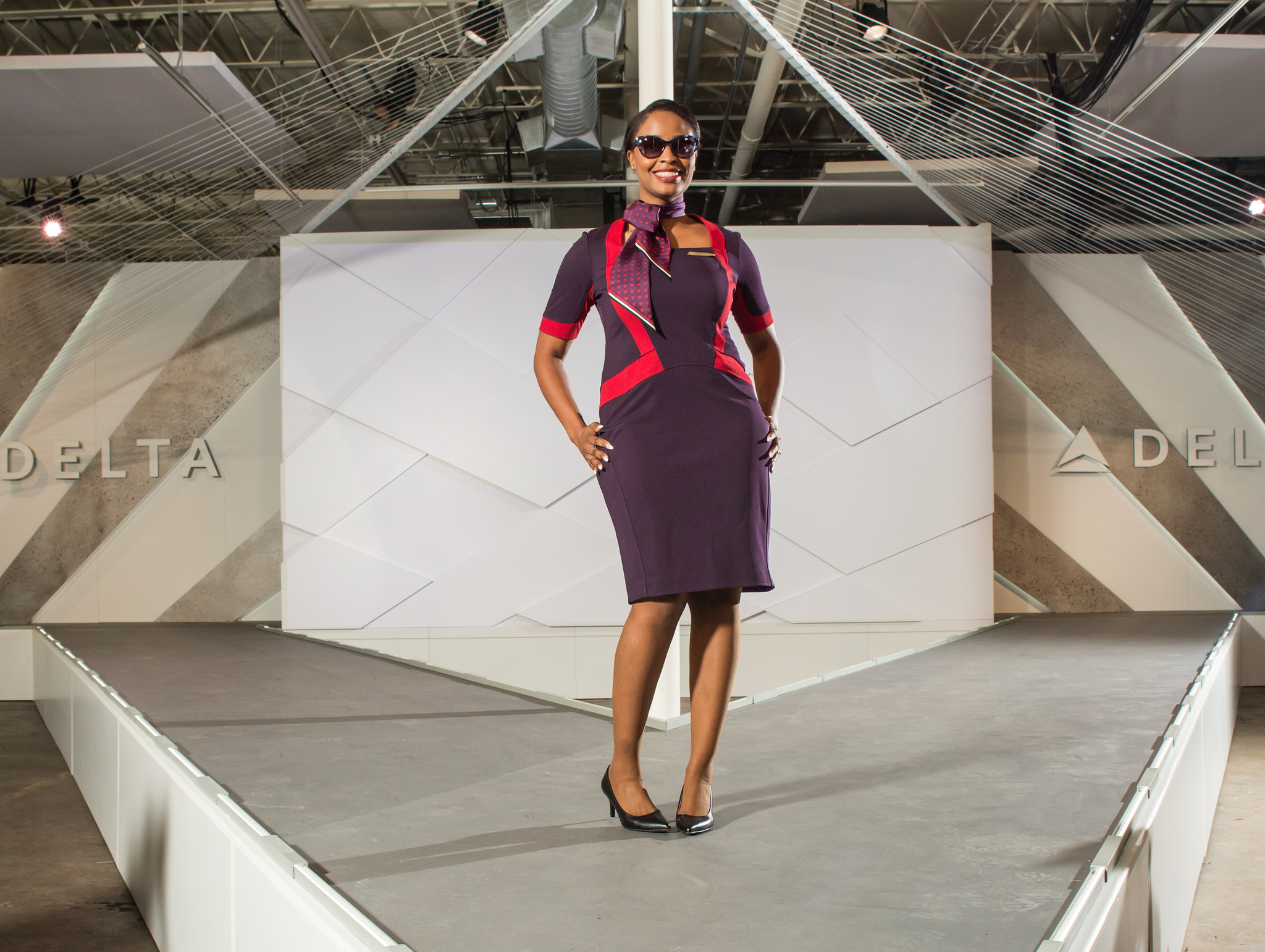
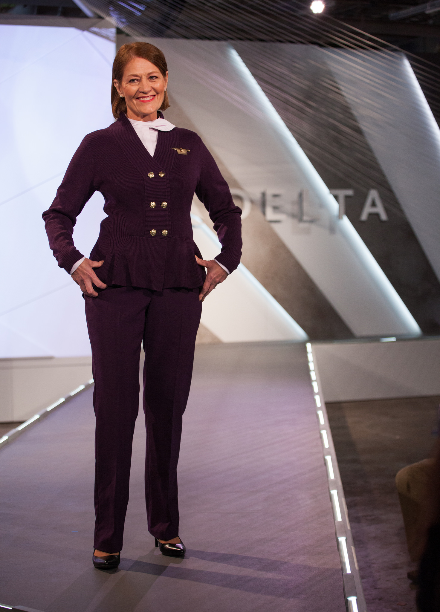
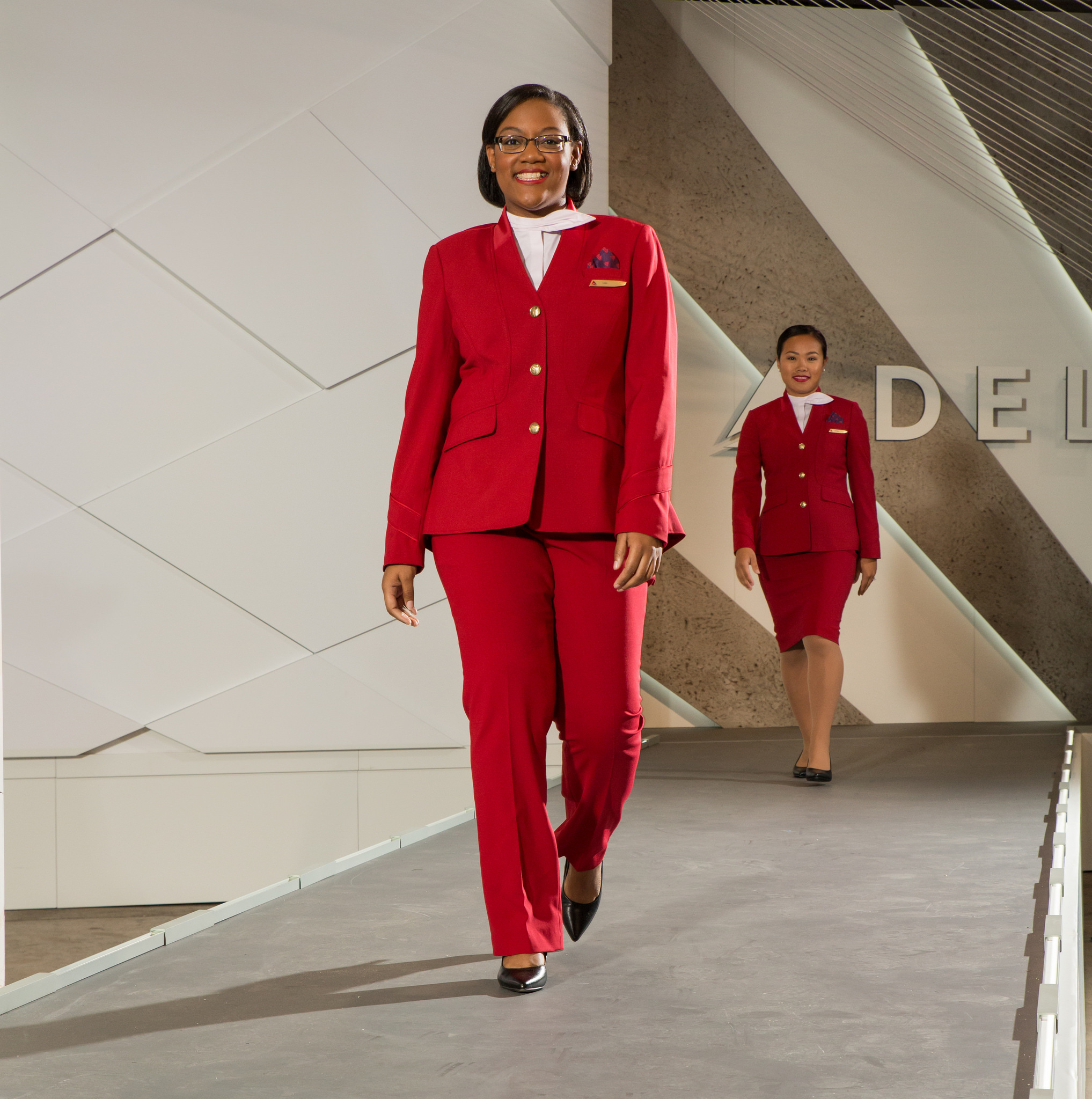
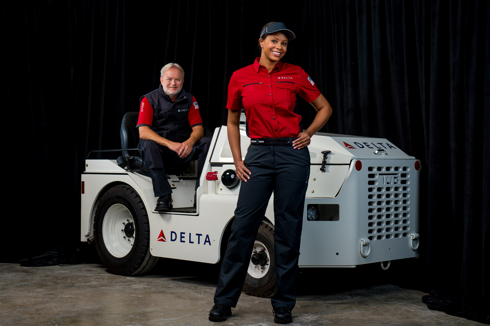
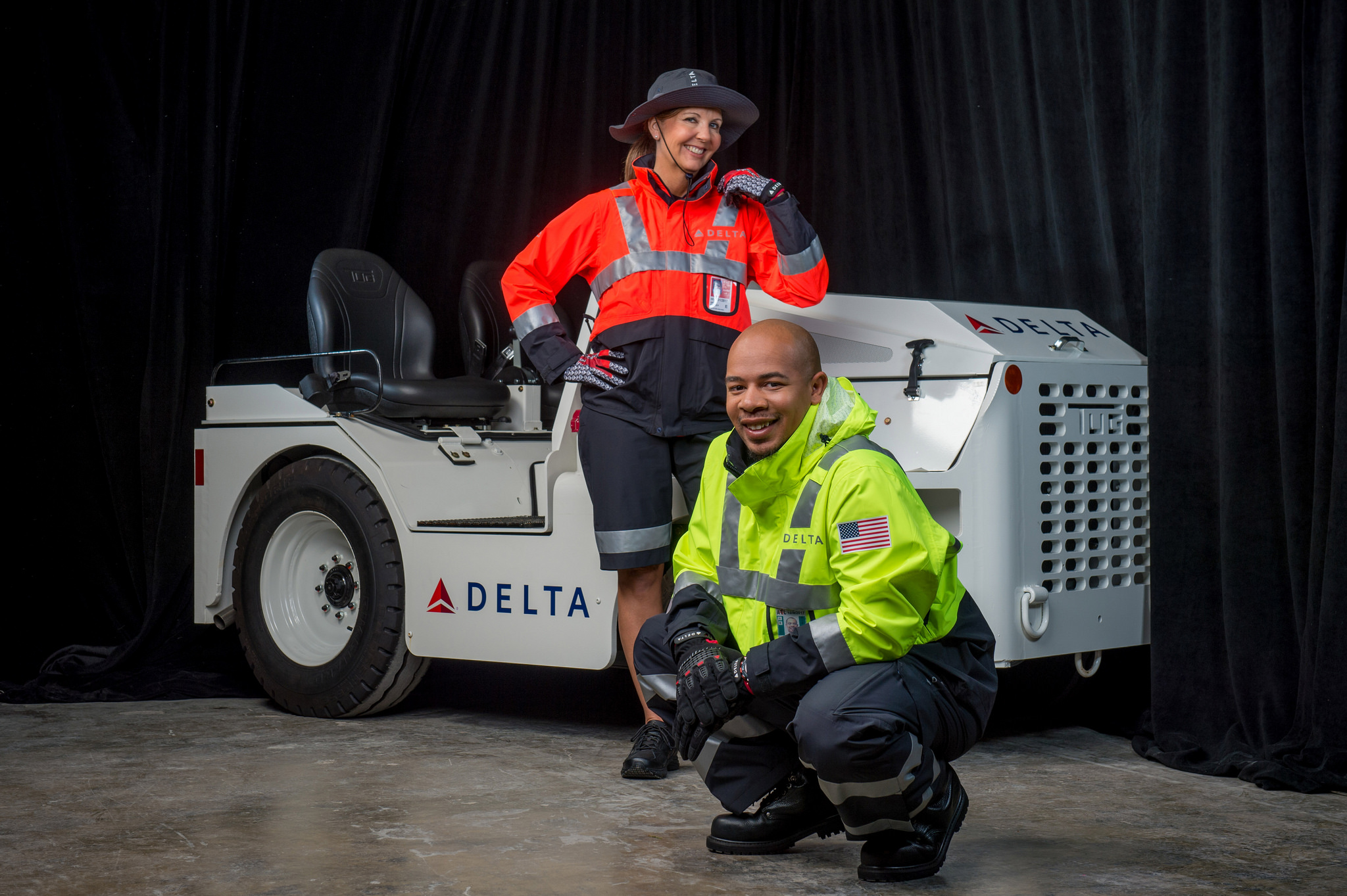
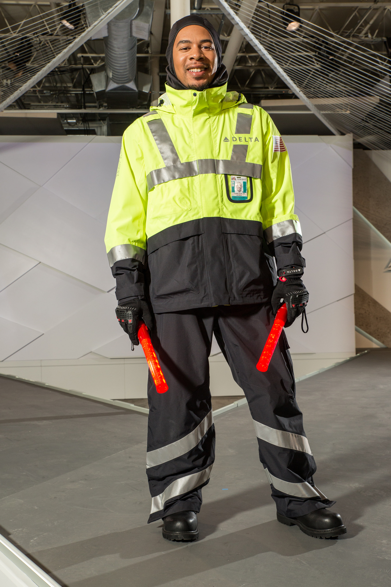
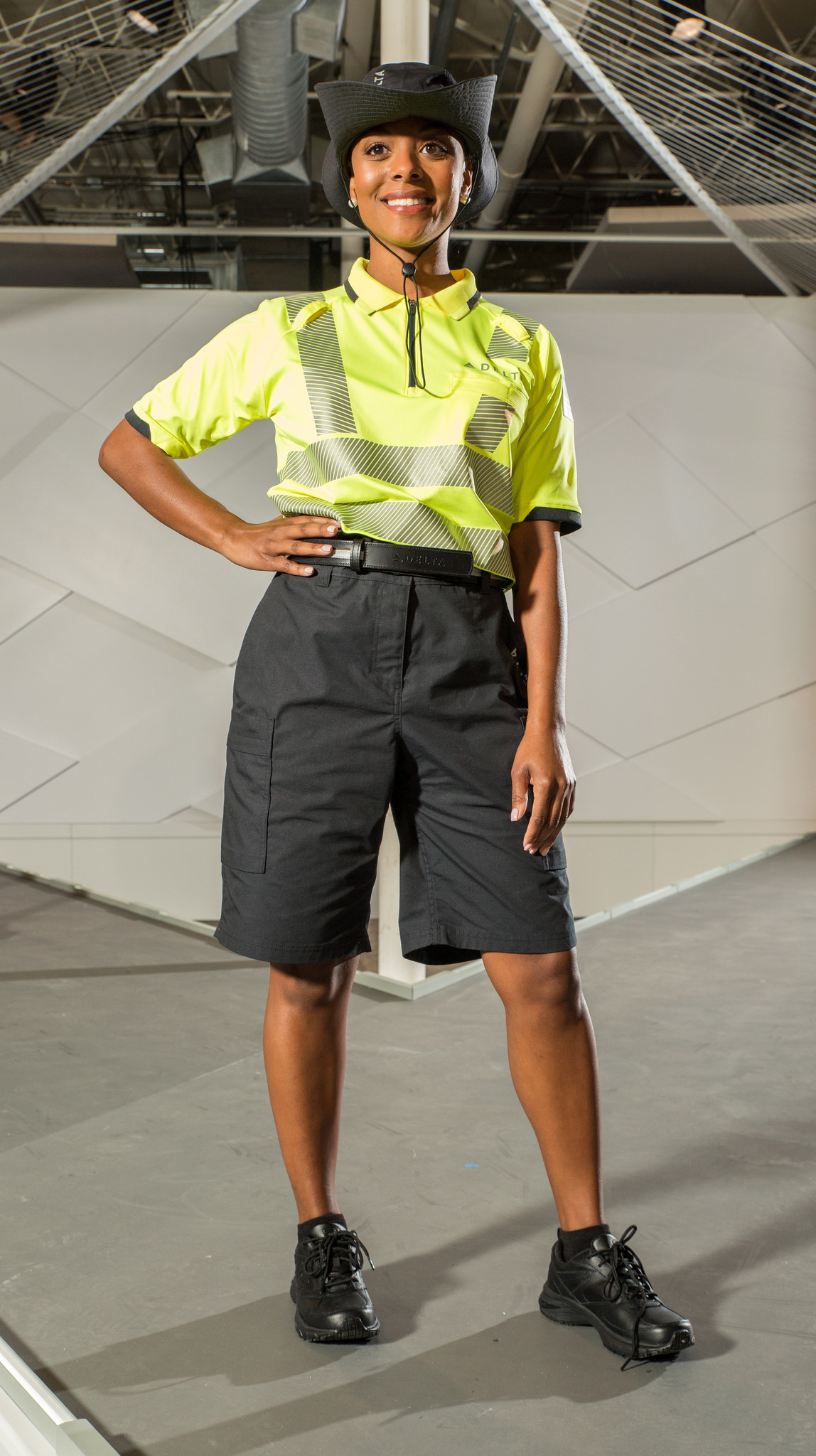
That being said, Delta's new uniforms do not look bad, but they are definitely...interesting. The general design looks fine, though not a real improvement over their great current look. One of the flight attendant designs looks almost retro which I like. Another is more modern but not in a garish way despite the somewhat random red stripe. Several of the men's designs have a traditional three-piece suit style. The ground ops are particularly nice since I can't clearly picture what they currently wear so the new outfits will certainly be more distinctive. Delta's famous Red Coats may have the best uniform in the new collection. What really pushes me to not like the new collection are the un-Delta colors. Well, one un-Delta color.
Headed to the office with a three-piece suit? (click to enlarge) (Phote: Delta Air Lines)
...but who picked that color??
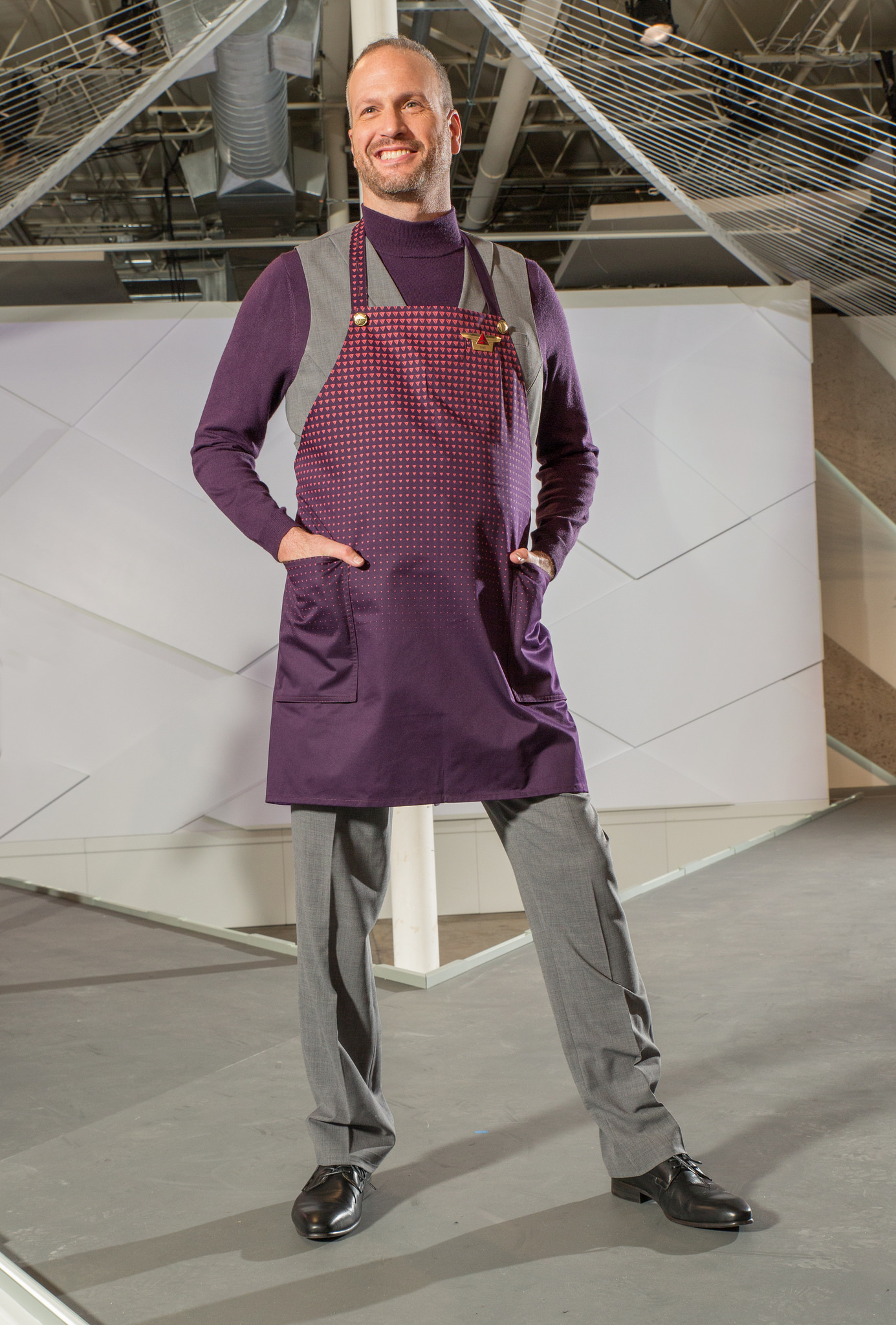
Delta has changed its branding multiple times in its history. What has remained consistent for decades, however, is the airline's signature "widget" and its red and blue color scheme. Red and blue. Not...purple. PURPLE! How did purple become the dominant color in the new uniform design? Yes, red is still prominently featured - the ground ops and Red Coats still sport the color. (In fact, the shades between these two employee groups appear to differ slightly which echoes the different shades of red on each half of the current incarnation of the widget...nice touch!) Gray - or "Groundspeed Graphite" - is a pretty standard neutral color even if most airlines opt for navy or black. But the purple is just jarring. When I see someone dressed like a plum walking toward me in an airport, I don't immediately think "Delta Air Lines." And why should I? It does not fit with any of the airline's branding or color scheme. Another detractor from the overall nice design is the color and pattern on the accessories. If you look closely at the pocket square in the picture of the male flight attendant above, you will notice it is purple with red polka dots. Also, an apron that was modeled is polka-dotted as well. Sorry, Mr. Posen, but polka dots do not scream "professional" in my opinion. And red and purple? I don't have to be a so-called fashion expert to know that those colors do not look good together.
The red dress was not broken
Personally, even without the odd choice of color, I classify this redesign as attempting to fix something that was not broken. The current Delta flight attendant look is classy but not boring. It stood out and made the Delta crew look elegant and stylish. Delta clearly had the best uniforms of the major U.S. carriers and that was not going to change even with American's recent update. However, now, Delta will have a design that leaves, at least me, scratching my head, going "Huh?" Bottomline, Posen did a nice job on the design. But he whiffed badly on the color palette and pattern.
This look was not broken, but Delta thought it needed to be fixed.
Gallery - Delta New Uniform Collection
